• Case study • UX redesign •
AskGamblers Redesign
Role
Lead UX designer
Date
2019-2020
Responsibilities
UX Strategy
User Research
Design System
UI Design
Overview
AskGamblers is a high-traffic review and comparison platform operating across regulated, multi-market environments. Over time the product accumulated design debt. Pages were overloaded with repeating card blocks, sponsored placements were obvious and actively avoided by users, and navigation had become inconsistent across sections. Analytics and heatmaps told a clear story: users were coming to read reviews and make informed decisions, but the information architecture was getting in their way.
01
My role
I led the full redesign process, making sure that we streamlined navigation, optimised conversion flows, and aligned design with business goals. This included user research, UX strategy, UI design, and started building a scalable design system. I also managed a small team of UX designers and collaborated with internal stakeholders.
02
Research
We started by analysing real user behaviour rather than assumptions. Google Analytics showed where users were entering, dropping off, and converting. Session recordings and heatmaps revealed how they actually moved through pages. User interviews added context to the patterns we were seeing in the data. The picture that emerged was consistent: users came to AskGamblers to research. They preferred search over browsing, disliked long pages with repetitive content blocks, and were actively reading reviews and switching between pages to compare options. Sponsored placements were being skipped entirely. The research made the direction clear.
Reduce friction on the path to reviews and get out of the way.
Google Analytics
Session recording
Heatmaps
Interviews
The data revealed a strong preference for using search, followed by browsing and filtering. Users disliked long pages filled with repetitive card blocks. They preferred shorter content and a more direct layout. Analytics also showed that users were actively reading reviews and switching between pages to compare offers.

03
Key Improvements
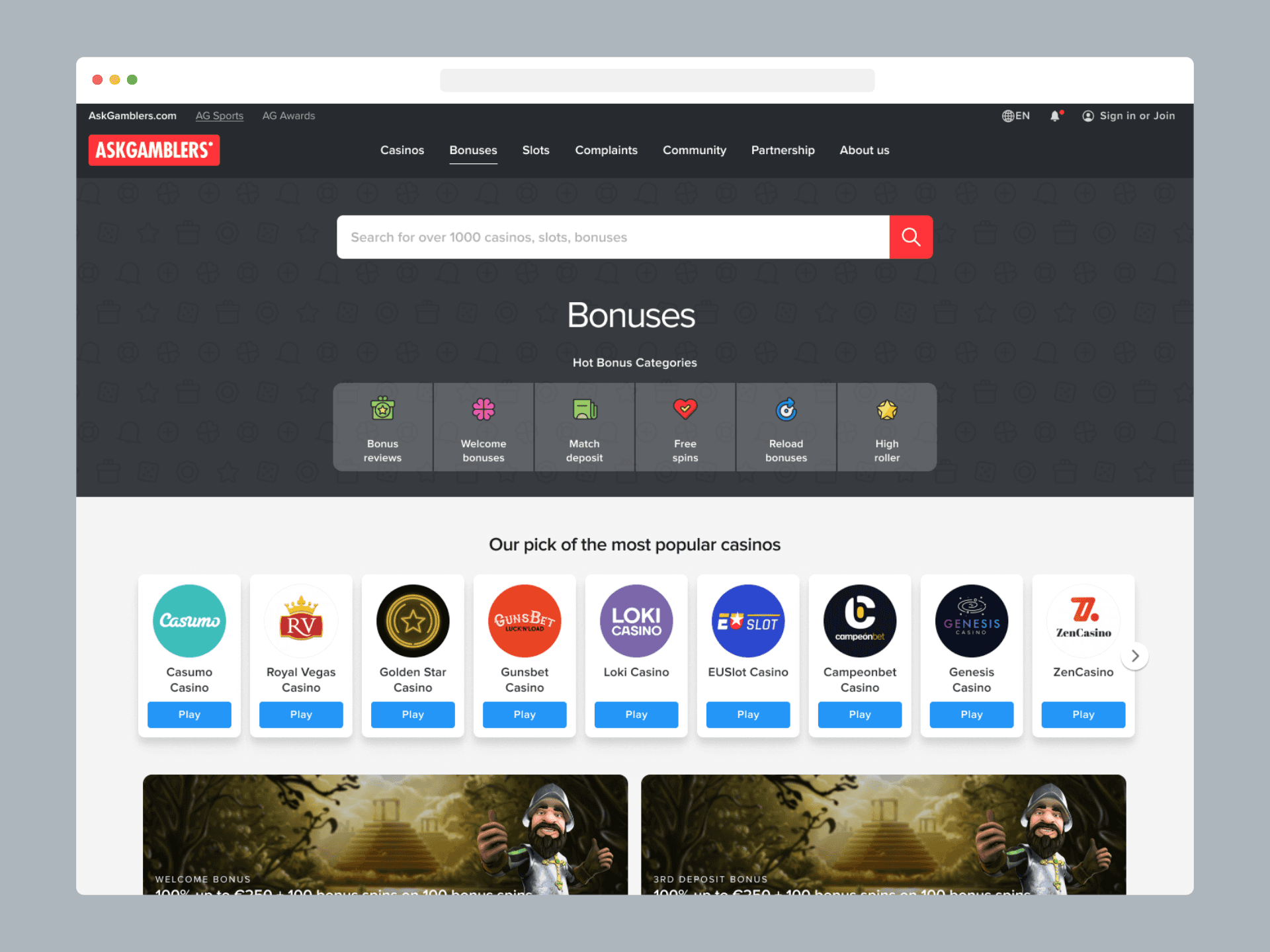
Homepage
The new homepage feels lighter and more focused. It is oriented more towards searching and navigating to specific sections or content of interest.

The “New on AG” section replaced multiple repeating content blocks across several verticals with a single tabbed carousel, making the content more compact and easier to browse.

Card Design
The original cards felt visually outdated and placed too much emphasis on the call-to-action, which came across as pushy when repeated. By reducing the visual weight of the buttons, the goal was to encourage users to read the reviews and make informed choices.

Category Pages
Each content category was redesigned with shared logic: a unified visual language, better alignment and spacing, and clearer headings and filters.


Listing pages with filtering
The listing pages already offered extensive filtering options, but user interviews revealed that the filters were overly complex and difficult to use. At that point, we had no internal data showing which filter properties users engaged with most. To establish a baseline for redesign, I analysed HotJar recordings to understand user behaviour and identify which properties are most useful for the users.

The findings led to a cleaner, horizontal filter bar with visible presets and the most frequently used properties displayed upfront. Less common options were moved into a modal to reduce visual noise. In future iterations, filter properties will be automatically sorted by usage rate, allowing ongoing optimisation based on analytics and user needs.

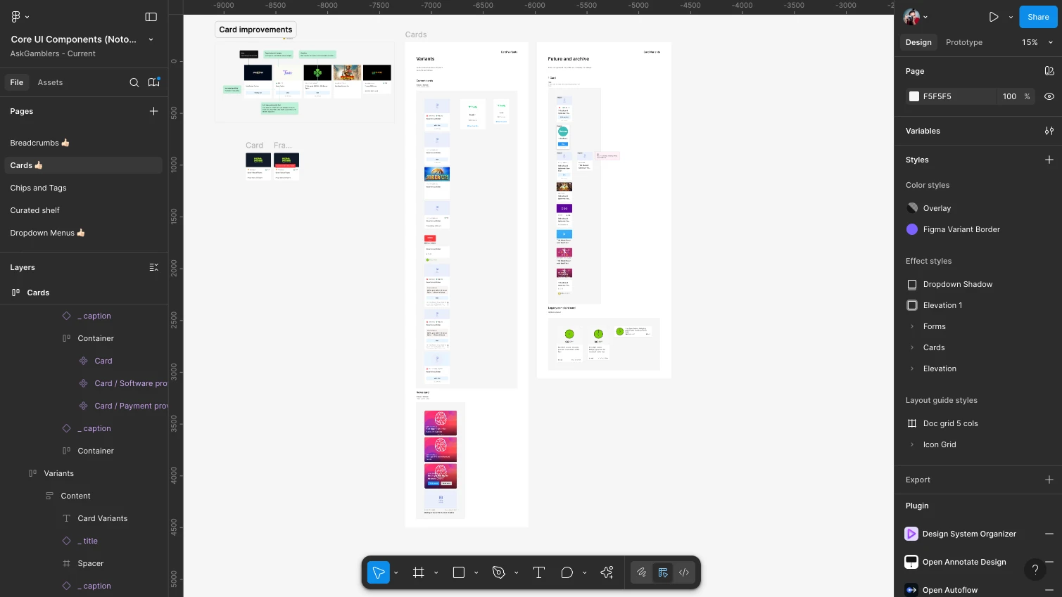
UI Kit
When I joined the team, the interface was built with improvised styles that made every update a struggle. I introduced a proper UI kit to bring order and consistency and migrated the project from Sketch to Figma.
We standardised spacing, typography, and colour across all screens, creating a unified look and feel. By building modular components, the team could finally work faster, maintain designs easily, and scale the product without breaking consistency.


04
Results
The redesign shifted how users moved through the product. The majority of clicks now flow through review pages rather than listing pages, reflecting a fundamental change in how users engage with the content. Session times averaged over 4 minutes and returning user rates remained strong. Revenue improved in parallel, though this was a shared outcome across design, SEO, and editorial work. On the delivery side, communication between product, development, and SEO improved, and time to ship new features decreased.
Quantitative
User engagement increased, with visitors spending more time on each page. The average session duration grew noticeably. At the same time, the bounce rate dropped, indicating improved content relevance and user flow.
Qualitative
Users reported that the site feels easier to use, and internal teams found it simpler to build on the updated system.
05
Reflection
The biggest constraint throughout was working within SEO, regulatory, and business boundaries that couldn't be moved. Good UX in this context meant finding clarity within those limits, not ignoring them. The filtering work was a good example: rather than waiting for perfect data, I used session recordings to establish a baseline and made decisions we could iterate on. That approach, starting with available evidence and building in room to improve, shaped how the team worked across the whole project.
Hiring a design leader, or need one for a while?
Let’s talk.
Marko Rosić PR Beyond Clicks Studio · MB 67353170 · PIB 114143089
Cara Lazara 26/21, 34000 Kragujevac, Serbia
© 2026 rosic.net